Inside the walls of the Young Building exists a world of creativity (and possibly some ghosts; we’ll circle back on that in October). As a Digital Production, Writing and Design student, I spend most of my time on the third floor, but down on the first floor is where Visual Arts students can be found.
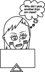
For this story, I wanted to try something different and see how some other Camosun students spend their days. I decided it was time to create a comic and make some art. So I asked around and was given the opportunity to explore more of my creative side by delving into the Visual Arts floor of the building that feels like my second home.
First, I met with one of my favourite Nexus cartoonists, Ray Nufer, creator of Ruby Rioux and the Bats from Saturn. Nufer took me through her process of drawing out her comic, from an idea to how she fine-tunes it to what we see printed (see page 10 for the latest Ruby Rioux). We came up with an idea for my comic; I drew out some thumbnail sketches, and I finished it off on my own.
I can make graphics using Adobe Illustrator but I’m not great at drawing with pencil and paper. It’s easier to draw things in perspective when you can manipulate a rectangle in the direction you want it to go than it is to draw out the four sides of a rectangle in the proper dimensions. I was really out of my comfort zone when it came to drawing anything that I knew my editor would want to see and possibly publish.
Whenever I’m out of my depth with graphic-design work I turn to YouTube. Unfortunately, the videos were going a bit too fast for my steep drawing learning curve. On to trick number two: printables. As a homeschool mom, I find a lot of curriculums online; printables are short assignments geared to a specific task or learning outcome. I didn’t find any printables on drawing comics but I did find a copy of Drawing Comics for Dummies. Ignoring the title (after laughing at how fitting it was), I began going through it.
I was going to draw a comic that had myself and my editor in it, but I quickly discovered that it’s very difficult to draw a beard and curly mustache. It was much easier to draw myself—all I had to do was follow the proper facial proportions and add my hair. I ended up changing my comic to one panel with only myself; problem solved. (Maybe one day I’ll try to draw my editor for the fun of it.)
The amount of time it took to draw a single-panel comic was a lot more than I expected, not counting the time spent learning to draw in a comic style. Once I decided to switch ideas I was able to draw the thumbnail fairly quickly, but the fine-tuning took me about five hours to complete. In an effort to minimize the amount of time I spent on it, I used Illustrator to put the final touches on my comic rather than trying to learn Procreate, the program that Nufer uses.

Next up in my Visual Arts adventure: painting. I went into an Intro to Painting lecture not knowing what to expect other than that they were doing a critique and I’d be given the assignment to complete at the end. It’s extremely intimidating walking into an art class halfway through the semester not knowing anything about painting. Thankfully I saw one familiar face: Nufer. The first thing I noticed was that she takes every opportunity to draw. Nufer’s sketchbook is full of Ruby Rioux drawings. I sat for a few minutes just watching her draw while she chatted with other students.
I began introducing myself so people knew why this stranger was infiltrating their class. It was the only way I could get rid of my own awkwardness of being there. When the instructor, Joseph Hoh, came in, he pulled me aside to quickly run through the lecture that went with the assignment we were about to critique. I hit information overload about halfway through. It must have shown on my face because when we got to colour theory Hoh said I could look it up online to refresh my memory. The main thing I needed to remember was the artist they were studying, Frank Stella, and how he used colour.
Stella discovered a way to combine colours that are considered unbalanced by using white lines between the colours. While Stella’s earlier works were paintings, he moved into sculptures as his career progressed. His installations are quite large—some of his works would fill an entire wall of a classroom. The assignment was an 8”x10” three-dimensional painting that demonstrated a colour theory concept.
It sounds so much easier than it is.
When Hoh was finished bringing me up to speed we joined the rest of the class and he introduced me to everyone. We were then given time to go around the classroom to look at all the completed assignments in order to critique them as a class. Each piece was so unique and beautiful. The colour theories Hoh had just explained started making sense to me.
Still intimidated by my lack of knowledge of painting compared to the half-semester’s worth the students had built up, I didn’t say anything during the critiques. I did, however, share similar thoughts as some of the students a few times. It was interesting to just sit there and listen to the students, to hear their thoughts.
They discussed whether the three-dimensional elements and colour combinations worked together. Part of the critique is also how the art is displayed. One piece cast a shadow on the wall, which added to the overall appeal of the piece. For another piece, it was suggested that it should be hung from the ceiling instead of the wall. I thought, “How is that possible?” but another student did just that, so it is possible. The creativity in every piece was incredible; some of the pieces were very intricate.
This is an introductory painting course, one of many Visual Arts courses Camosun offers that makes me wonder how many more talented artists lurk in the halls of the Young Building and in the art studios behind the building. I’m curious about who might go on to have art hanging in a gallery one day, or who already does.
Some students shared a bit about their experiences creating their art pieces. When one student said they started out doing one thing but it turned into something else, I was put at ease: if what I wanted to do didn’t turn out, I’ll just make it into something else. Far too often I strive to be perfect, and when I fail, the weight of defeat feels almost unbearable. I also realized that if I had a complete and utter fail it would make for a funny story. So whether my painting turned out to be “dope” or “nope” I’d have a story either way.
Another thing I learned was how to present prototypes of art installations for grant applications. It sounds a lot more complicated than it really is. An artist will make a smaller version of the installation and then put a tiny mannequin that’s proportional to the intended size of the art piece next to it to give perspective. While I was in the lecture, students were taking photos of their art pieces with mannequins.
Picking colours for painting is harder than it is for graphics. For one, you’re committed to what you put on the canvas. Second, if the paint isn’t the right colour, it has to be mixed with another paint to get the right colour. In Illustrator, I can run a photo through Adobe’s colour webpage and it will spit out the RGB codes. I selected a colour palette based on open-source graphics because the background wasn’t transparent (I’ve kept this secret from everyone, including my instructor, until now). I don’t know how to mix paint to get new colours and this project was not the time to learn, so I limited myself to the colours I bought.
Confession: Michaels is one of my happy places, and this adventure gave me an excuse to go to Michaels and buy paint. My friend Kirby seemed a little shocked that I’d buy so many colours at one time for what might be a single project. Self-control kicked in when I put the metallic colours back; 24 paints seemed to be enough. However, if painting becomes a regular thing, I’m going back for the metallic paint.
Armed with a canvas, paint, paintbrushes, and an idea, I went home and started to create. As with all artistic adventures, my idea was bigger than time allowed, but I do enjoy art projects. My chosen mediums are chalk pastels and multi-medium collages. (I used to give art to my family and friends when I didn’t have money for Christmas presents; my mom proudly hangs it on the wall, which is nice since none of my school art ever made it to the fridge.)
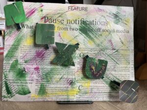
Prepping my canvas for my wild idea of a totally Nexus-inspired work of art took layers of Mod Podge and patience. I had to use three layers of newsprint to get an 8”x10” canvas covered the way I wanted it to be. Then I had to flip it over to wrap the canvas properly. By the end I thought, “Why did I think this was a good idea?” However, the finished product was worth all the effort.
Next, I consulted a book that looks at different painting techniques that came with an easel a friend bought me 12 years ago. Looking at those nine techniques became the most intimidating moment of this project. I stared at the book for what felt like a good half hour before putting paint to paper. I then broke it down into steps: loading paint on my brush; reading the book; painting; reading the book again; painting a bit more. It was painful. If I continue to paint, I really need to take Intro to Painting. I have absolutely no idea what I’m doing.
I’ve always had a deep appreciation for painters and was excited to sit in on a painting class, but, as it turns out, Bob Ross made it look easier to execute than it really is. Wishing I had gone to all the “paint and wine” nights I had been invited to, I practiced the techniques. The goal was to have a different painting technique for each letter in the word “Nexus.” All I needed was something decent that was large enough for one letter that demonstrated what I learned about colour theory in painting.
Now, I don’t always make the best decisions, and chaos breaks out more often than I like to admit. I have bipolar, and when manic I have a tendency to pull out the chalk pastels or the vast amounts of scrapbooking supplies passed on to me by my mom and start letting creative juices fly. I’ll sit on the floor, fill a canvas, toss it to the side, and grab another canvas. This can go on for days. I don’t have the best sense of time on a good day, and zero concept of time when manic. So, of course, I sat on the ground to paint instead of using the lovely easel I own. That is, until I knocked over the jar of water used to clean my brushes. With a puddle of water on my floor and my practice paintings now ruined, I decided to set up the easel and take a break. My frustration was too high to try to keep painting.
After taking a break and setting up my easel, I started over. This round went smoother than the first; the techniques were less intimidating. My colour concept was more congruent between the letters, except for one letter where I used the wrong colours. I also messed up when trying to do a “thick on thin” technique; I got it backwards. I had a bit of room on my canvas to fix one letter so I tried a different technique to replace thick on thin and tried to fix the letter that had the wrong colours.
As a kid, I used to love throwing paint at a piece of paper; I learned that it’s a lot easier to splatter tempura paint than it is acrylic paint. The obvious difference is the viscosity, but I may have used the wrong brush or there may be a trick to flicking the brush; I don’t know. I’m glad I only needed a small amount of splatter; my frustration was starting to rise again.
The scariest moment of this adventure was painting the newsprint-covered canvas. I wasn’t going to cover another canvas, so whatever happened was going to be the final product. I tested out what I wanted to do on the canvas paper I was using for the letters; it worked. Taking a deep breath, I loaded more paint onto my brush and started painting over the newsprint. Thankfully, it turned out the way I wanted it to.
Since this was a three-dimensional painting I needed the letters to pop out from the canvas. My crafty mom skills immediately thought “toilet-paper roll,” because far too many crafts use toilet-paper rolls.
Applying acrylic paint to a toilet paper roll is tricky. First of all, it’s difficult to hold while painting. Second, the more paint I applied, the flimsier the roll got. I needed a fair amount of paint to cover the roughness and lines of the roll. I was relieved when it was finished.
Another confession: I like using a glue gun. It’s a weird thing, I know, but it’s the truth. I was happy to pull out the glue gun to assemble my painting. Even weirder, I was disappointed we only had one glue stick.
Doing this, I realized how much I missed doing crafts with my kid. Homeschooling gave us a lot of craft time. But I had enough glue to put the letters on my canvas, and that’s all that mattered right now. I even managed not to get glue everywhere—anyone who has used a glue gun knows the challenge of hot glue strings.
It didn’t take long to assemble: gluing five letters onto a canvas only took ten strips of glue. The tricky part was spacing out the letters. I did the best I could; I’m used to using arrow keys to move graphics and text into alignment in Illustrator so I see where everything doesn’t align. But this is a bit of an abstract piece so alignment doesn’t need to be perfect.
Looking at my painting and thinking about all the time and effort and the water mishap, there’s an immense sense of satisfaction. I had an idea and, for the most part, it turned out the way I wanted it to. The newsprint-wrapped canvas with abstract colour splashed across it (without completely covering it) with the letters popping out all worked exactly how I wanted it to. The painting of the individual letters didn’t quite work out as well. But it’s my first real attempt at painting so I’ll cut myself some slack.

I’ve always had a creative side, and whether it’s words or visual arts, the exploration brings me a sense of joy and peace. Despite being pushed out of my comfort zone on these two projects and spending more time on them than originally planned, or perhaps maybe because of that, I learned a few things.
First, as my son grew out of his arts-and-crafts age and into different activities, I left behind my focus on art as well. I really need to get back to that. Wrapping the canvas was time-consuming and a little bit frustrating but it also reminded me of how much I used to enjoy making multi-medium art pieces. I may not get back into it right now because with school I don’t have the time; there would be a constant art mess by my desk in my home office. However, my easel is still up, and my paints and brushes have found a home in a basket on my shelf. It would only take a few minutes to set up to paint when school gets stressful.
Second, drawing comics is a lot more fun than drawing in perspective. Plus, there are so many different styles of comics that I’m intrigued to see what style I might like drawing most and what characters I could create. It’s also a more portable artistic outlet; I have a small sketchbook for graphic design drawings already. I just need to use it.
I know one thing for sure: I need to be a lot more like Nufer and take advantage of every opportunity to draw in order to improve my skills.
If I can find my own characters and story, you might see me in the comics section one day.
